Courtesy: S Richter et al/Journal of Physics D: Applied Physics
Clustering is a machine learning technique used to group similar data togehter into subsets based on inherent similarities and patterns. It is a techineque that is wildly used in explaratory data analysis in order to reveal insights about data. It has a significant overlap with classification as many algorithms that are used in clustering are also used for classification. Such algorithms include K-Means-Clustering, K-Nearest-Neighbor, and many others.
In this blog, we will be exploring clustering as applied to the penguins dataset.
About the Data
The penguins dataset is a very popular dataset used for both clustering and classification algorithm testing and learning. It was collected as part of a study on penguins’ sexual dimorphism. The data contains the following columns:
species: (Chinstrap, Adélie, or Gentoo).
culmen_length_mm: the length of the dorsal ridge of the penguin’s bill in millimeters.
culmen_depth_mm: the depth of the dorsal ridge of the penguin’s bill in millimeters.
flipper_length_mm: the length of the penguin’s flippers in millimeters.
body_mass_g: the mass of the penguin in grams.
island: the island on which the penguin was located (Dream, Torgersen, or Biscoe).
sex: the sex of the penguin.
Let us load the data:
Loading and Preprocessing
import matplotlib.pyplot as pltimport pandas as pdpenguins_data = pd.read_csv("penguins_size.csv")penguins_data.head()
species
island
culmen_length_mm
culmen_depth_mm
flipper_length_mm
body_mass_g
sex
0
Adelie
Torgersen
39.1
18.7
181.0
3750.0
MALE
1
Adelie
Torgersen
39.5
17.4
186.0
3800.0
FEMALE
2
Adelie
Torgersen
40.3
18.0
195.0
3250.0
FEMALE
3
Adelie
Torgersen
NaN
NaN
NaN
NaN
NaN
4
Adelie
Torgersen
36.7
19.3
193.0
3450.0
FEMALE
Right of the bat, we can see that that there are rows in the dataset that contain NaNs. One way we could deal with it is by imputing the values. However, it would be much simpler to just drop them as there are only a few such rows.
penguins_data = penguins_data.dropna()
Next, we want to encode the said labels for simplicity.
In this case species_scheme is an array that contains the previous labels with index that corresponds to their new label. If it sounded like a bunch of jibberish, here is contents:
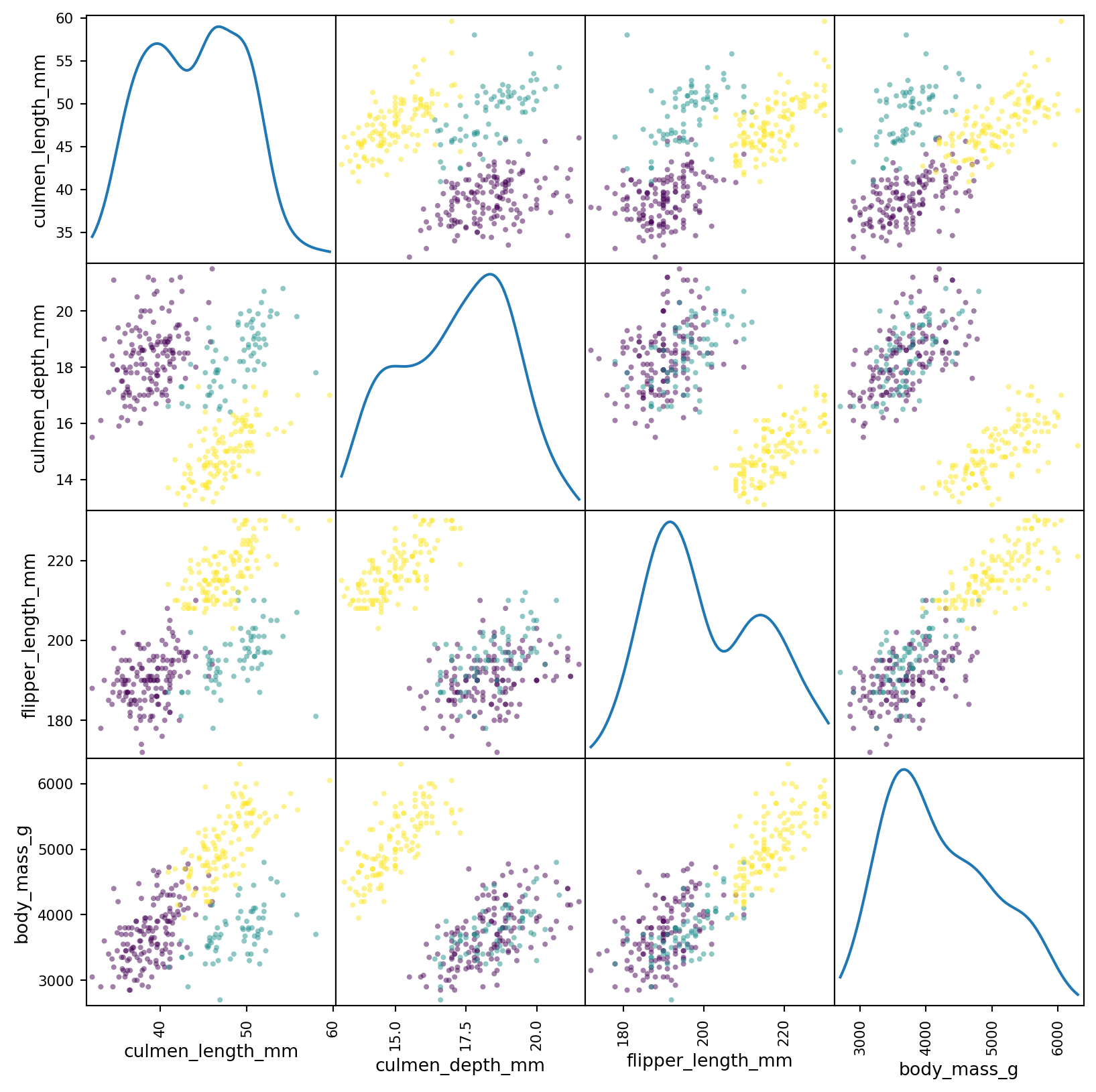
We can see that there exists a pretty clear separation between the distributions of all the subsets. This matrix is a lot of data to look at - at once. Instead we can condense most of the data into two dimentions using principal component analysis (PCA). This will reduce the dimensionality of the data into two, dummy, dimentions. In essence, it will be a projection of the data from the four dimentional space into two dimentions.
First, thing we want to do before that is to standardize the data. This is done fairly easily by using StandardScaler from Scikit-Learn.
from sklearn.preprocessing import StandardScalerscaled_numeric_penguins_data = StandardScaler().fit_transform(penguins_data[numeric_cols])
Performing PCA is pretty straight forward as well.
from sklearn.decomposition import PCApca = PCA(n_components=2, random_state=42)two_component_penguins_data = pca.fit_transform(scaled_numeric_penguins_data)
Now that we have the projection of the data, let’s graph it.
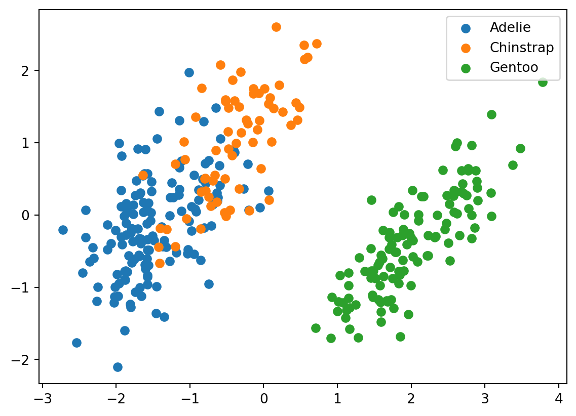
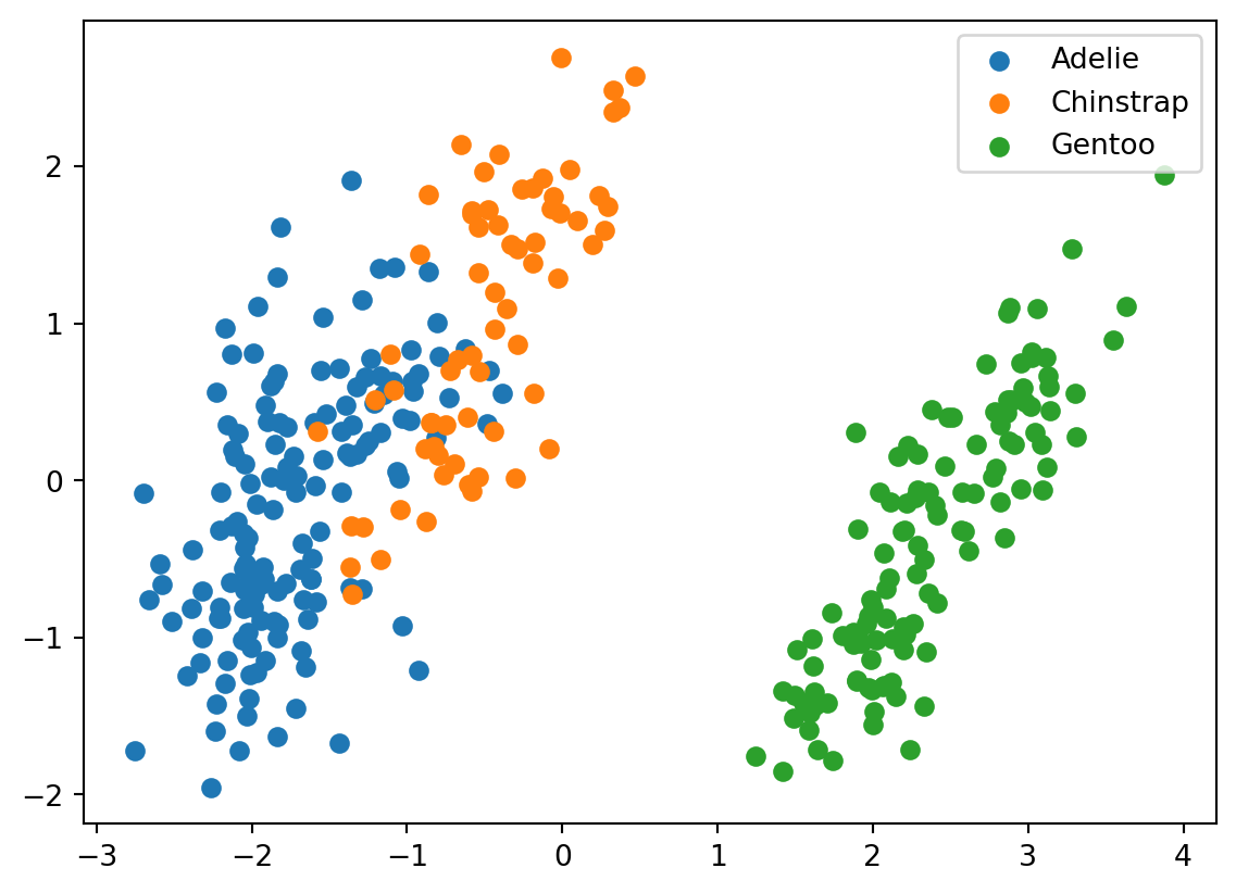
for i, target_class inenumerate(species_scheme): indices = penguins_data["species"] == i plt.scatter(two_component_penguins_data[indices, 0], two_component_penguins_data[indices, 1], label=target_class)plt.legend()
<matplotlib.legend.Legend at 0x2925394d0>
We can see that Gentoo are pretty distinct from the other two types of penguins. There is also some seperation between Adelies and Chinstraps’s, but it is smaller in comparison. This will make it more difficult for our clustering algorithm to distinguish between them.
Clustering
We will try to distinguish between the penguins using K-Means-Clustering (K-Means). K-Means works by randomly initiating centers of each cluster (in our case it will initiate 3). It will then assign each point to a cluster based on which center the point is closest to. The centers of each cluster are then recalculated, and the steps are repeated until convergence or a step limit is reached. This is a good clustering algorithm for this dataset as the datapoints resemble unordered blobs with no specific shape that are somewhat distant from one another.
from sklearn.cluster import KMeanskmeans = KMeans(n_clusters=3, random_state=42)predictions = kmeans.fit_predict(scaled_numeric_penguins_data)
/Users/danielsabanov/.pyenv/versions/3.11.6/lib/python3.11/site-packages/sklearn/cluster/_kmeans.py:1416: FutureWarning: The default value of `n_init` will change from 10 to 'auto' in 1.4. Set the value of `n_init` explicitly to suppress the warning
  super()._check_params_vs_input(X, default_n_init=10)
Let’s just verify that the labels that we got were in the range from 0 to 2.
set(predictions)
{0, 1, 2}
Now, we can plot the projection of the data again, this time using the predicted labels.
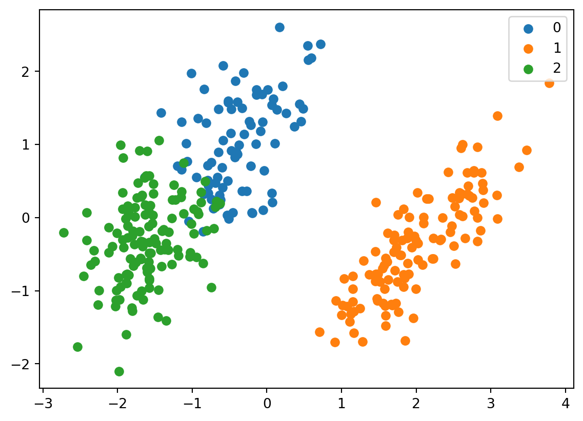
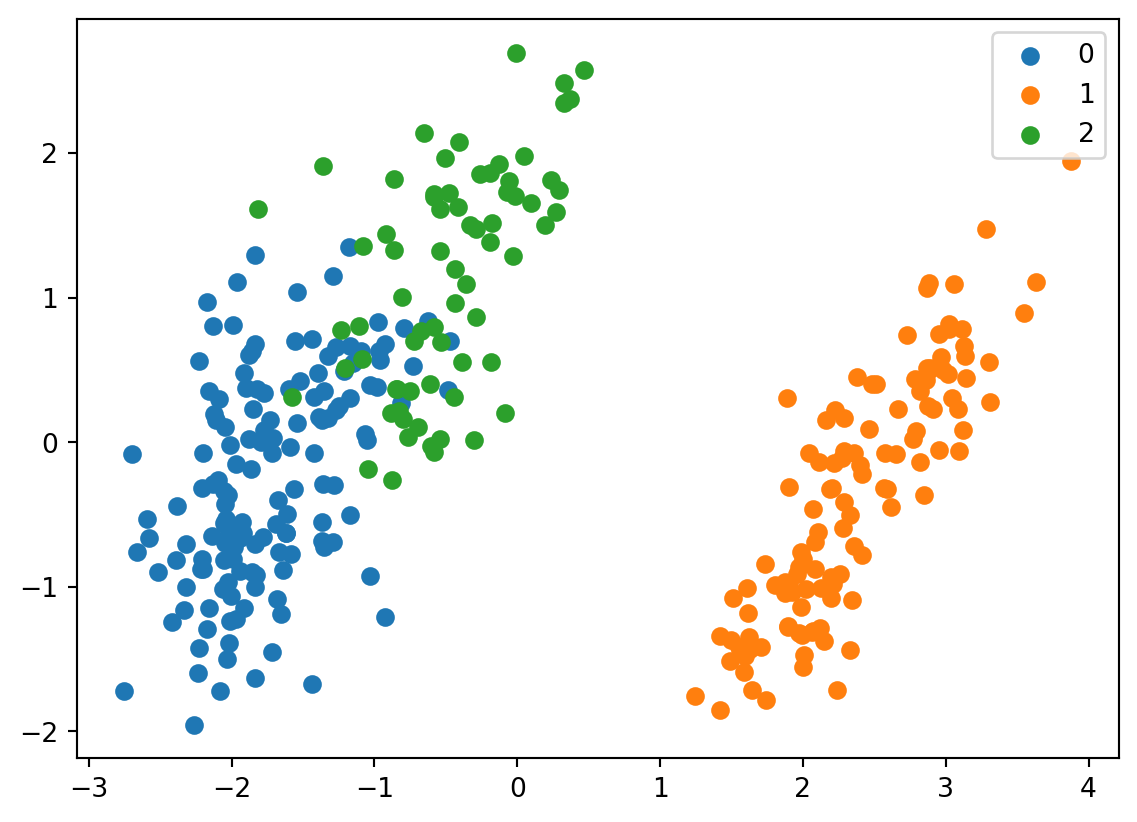
for i, target_class inenumerate(set(predictions)): indices = predictions == i plt.scatter(two_component_penguins_data[indices, 0], two_component_penguins_data[indices, 1], label=target_class)plt.legend()
<matplotlib.legend.Legend at 0x296cd94d0>
It looks fairly similar. It also gives us an understanding which label corresponds to which species based on their distribution in the graph. We can see that 0 corresponds to chinstrap, 1 corresponds to gentoo, and 2 corresponds to adelie.
We can store the data back into the dataframe for easier access.
penguins_data["predictions"] = predictions
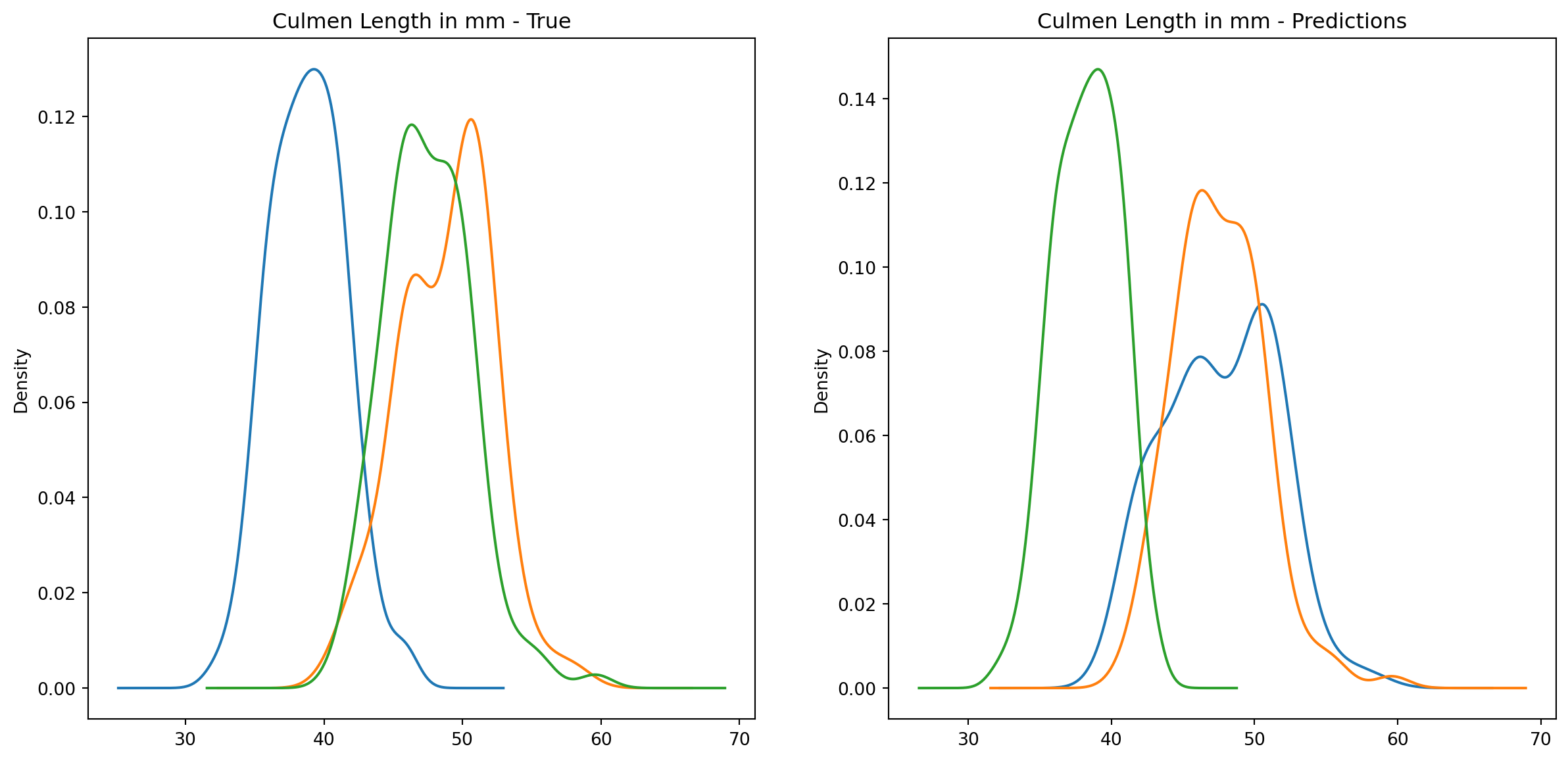
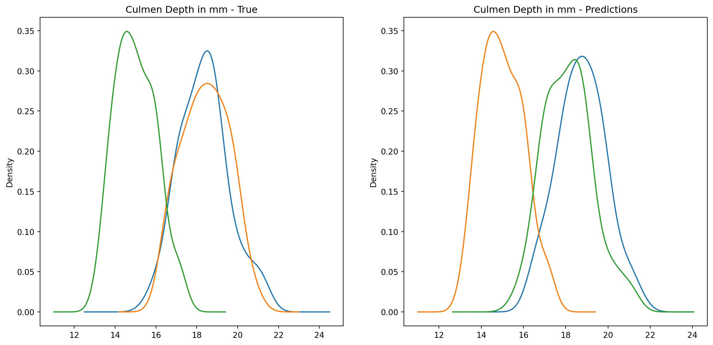
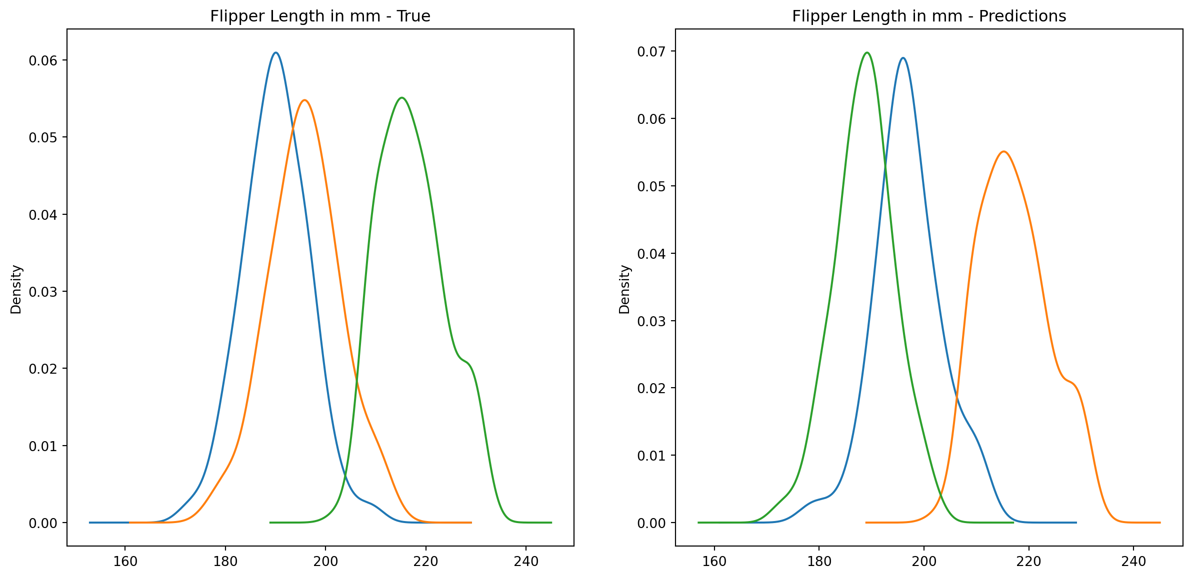
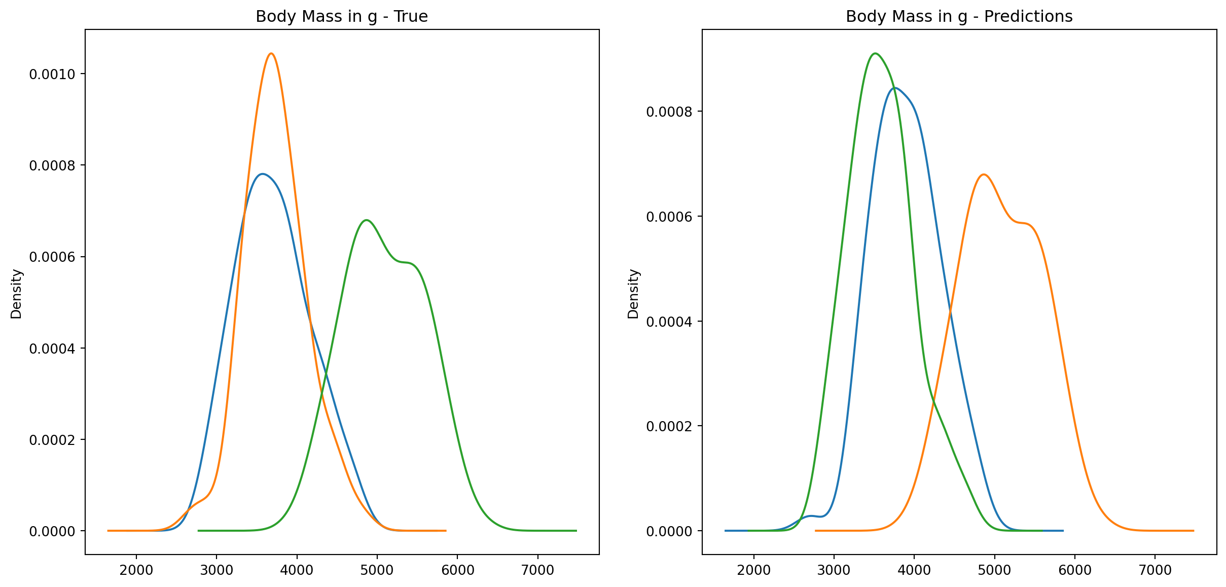
Let’s take a closer look at the distribtions in the data.
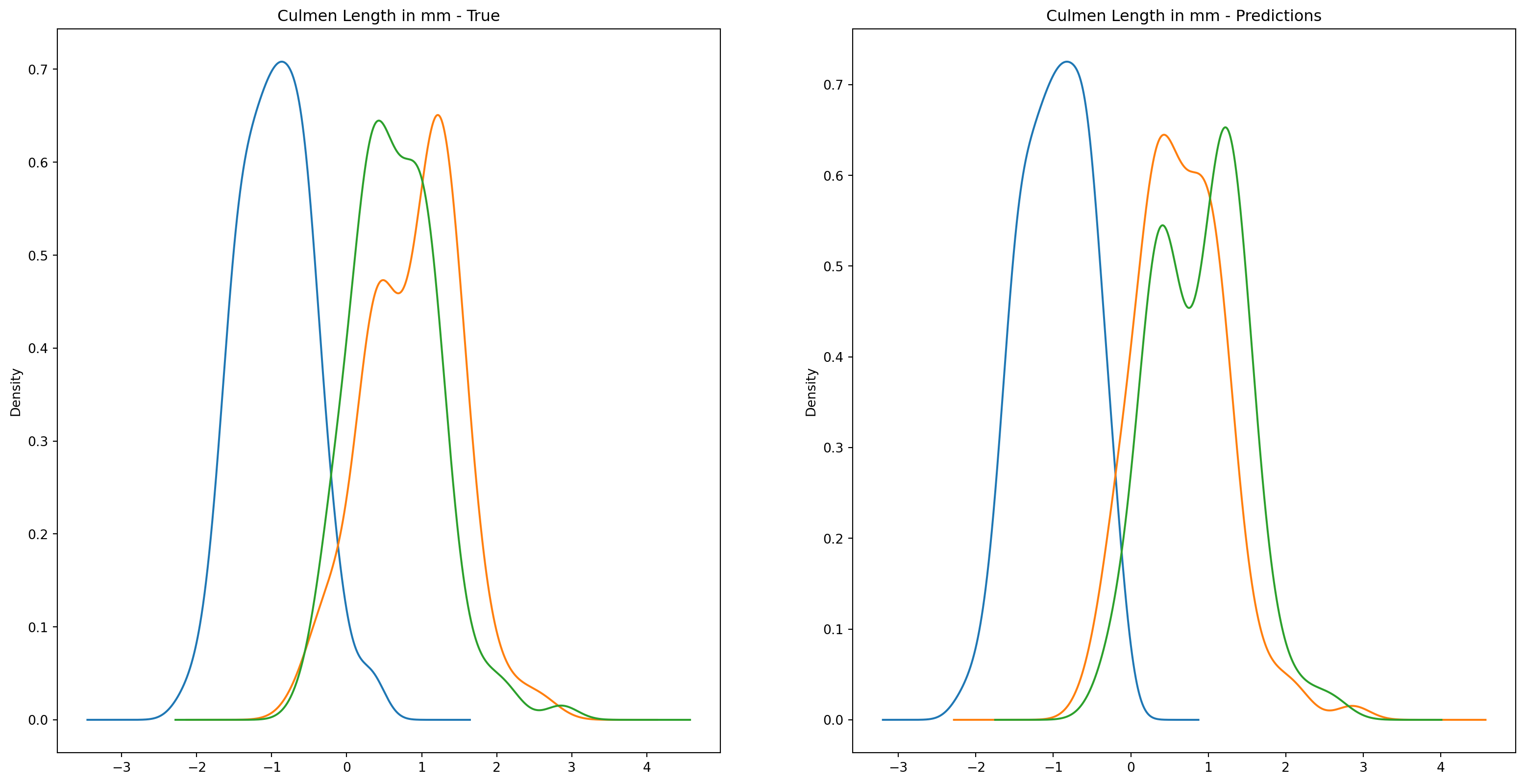
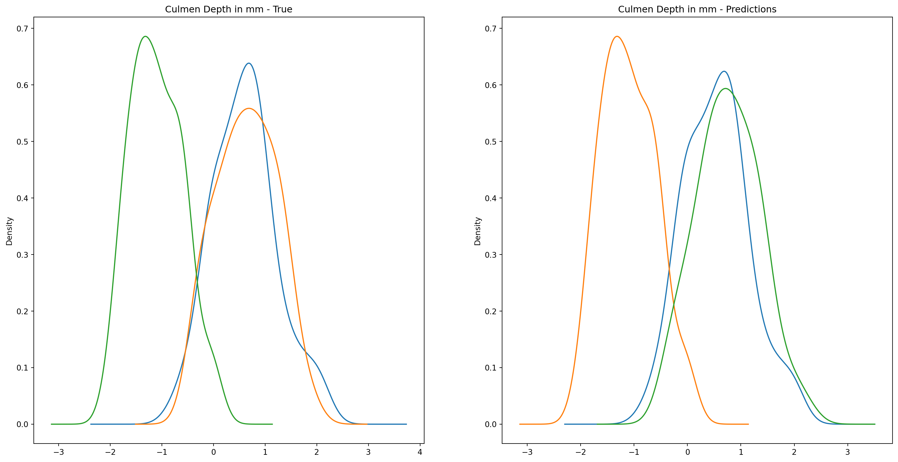
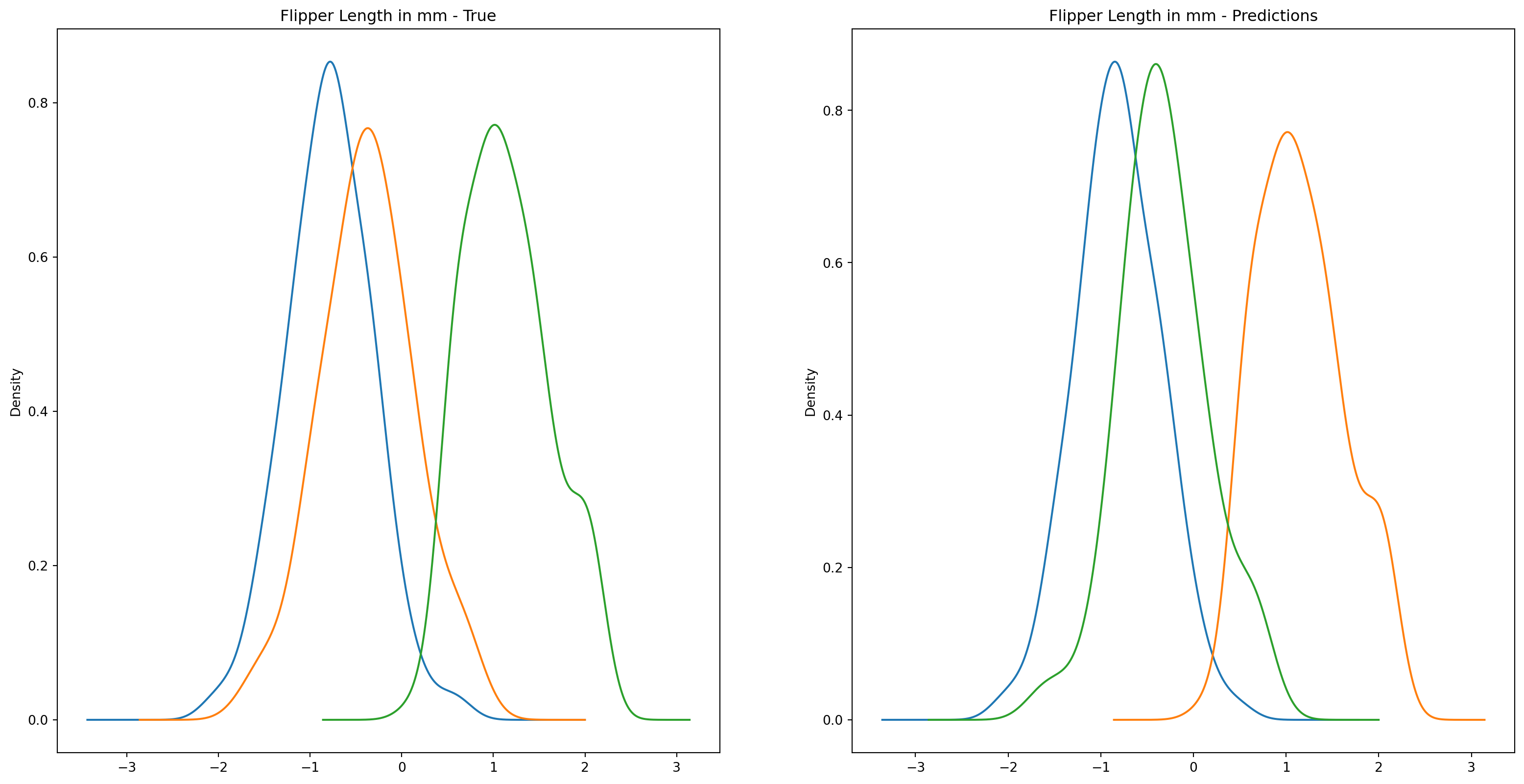
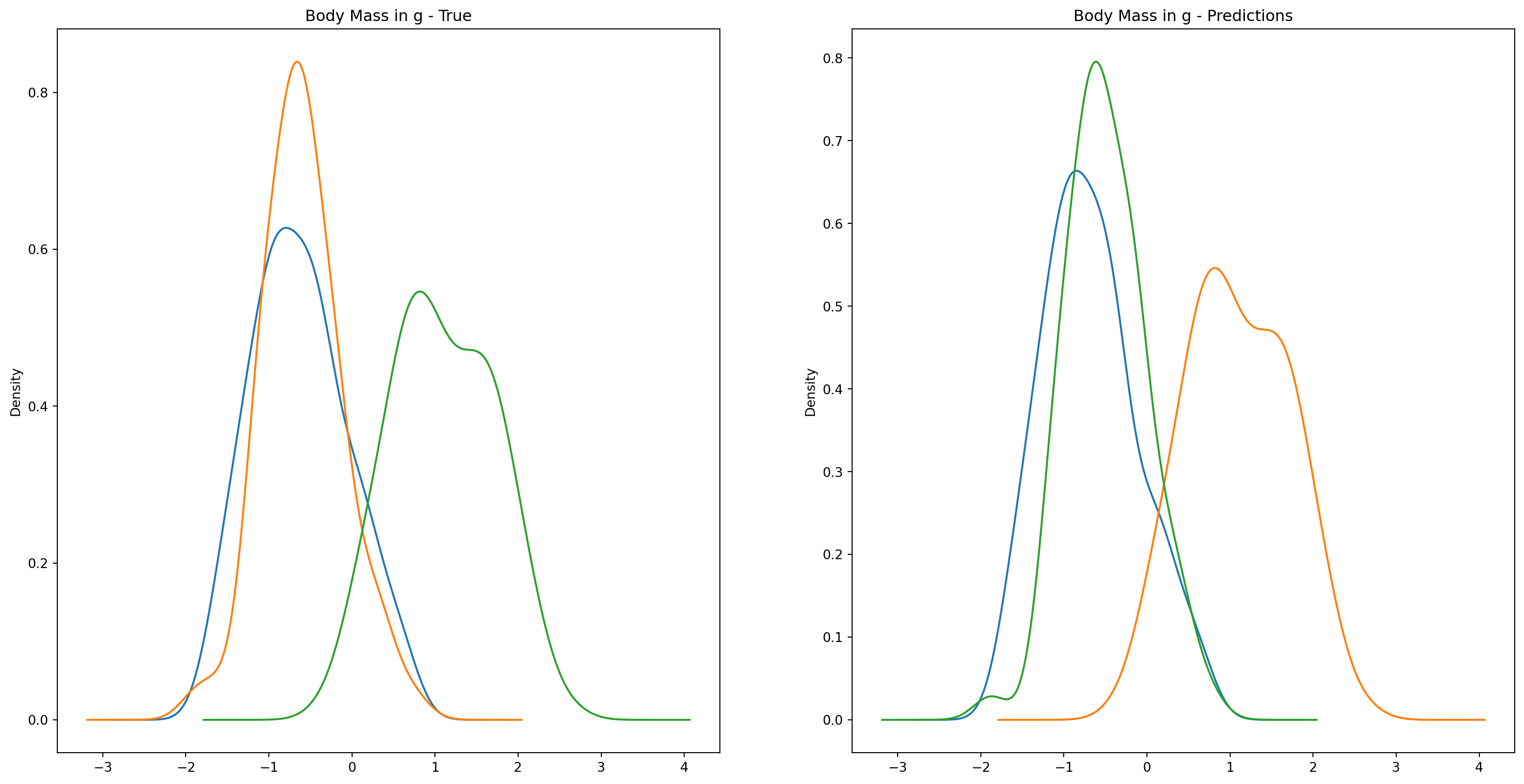
fig1, ax1 = plt.subplots(ncols=2, figsize=(15, 7))fig2, ax2 = plt.subplots(ncols=2, figsize=(15, 7))fig3, ax3 = plt.subplots(ncols=2, figsize=(15, 7))fig4, ax4 = plt.subplots(ncols=2, figsize=(15, 7))penguins_data.groupby("species")["culmen_length_mm"].plot.kde(ax=ax1[0], title="Culmen Length in mm - True")penguins_data.groupby("species")["culmen_depth_mm"].plot.kde(ax=ax2[0], title="Culmen Depth in mm - True")penguins_data.groupby("species")["flipper_length_mm"].plot.kde(ax=ax3[0], title="Flipper Length in mm - True")penguins_data.groupby("species")["body_mass_g"].plot.kde(ax=ax4[0], title="Body Mass in g - True")penguins_data.groupby("predictions")["culmen_length_mm"].plot.kde(ax=ax1[1], title="Culmen Length in mm - Predictions")penguins_data.groupby("predictions")["culmen_depth_mm"].plot.kde(ax=ax2[1], title="Culmen Depth in mm - Predictions")penguins_data.groupby("predictions")["flipper_length_mm"].plot.kde(ax=ax3[1], title="Flipper Length in mm - Predictions")penguins_data.groupby("predictions")["body_mass_g"].plot.kde(ax=ax4[1], title="Body Mass in g - Predictions")plt.plot()
[]
Alternatively, we can also overlay the distributions for easier comparison.
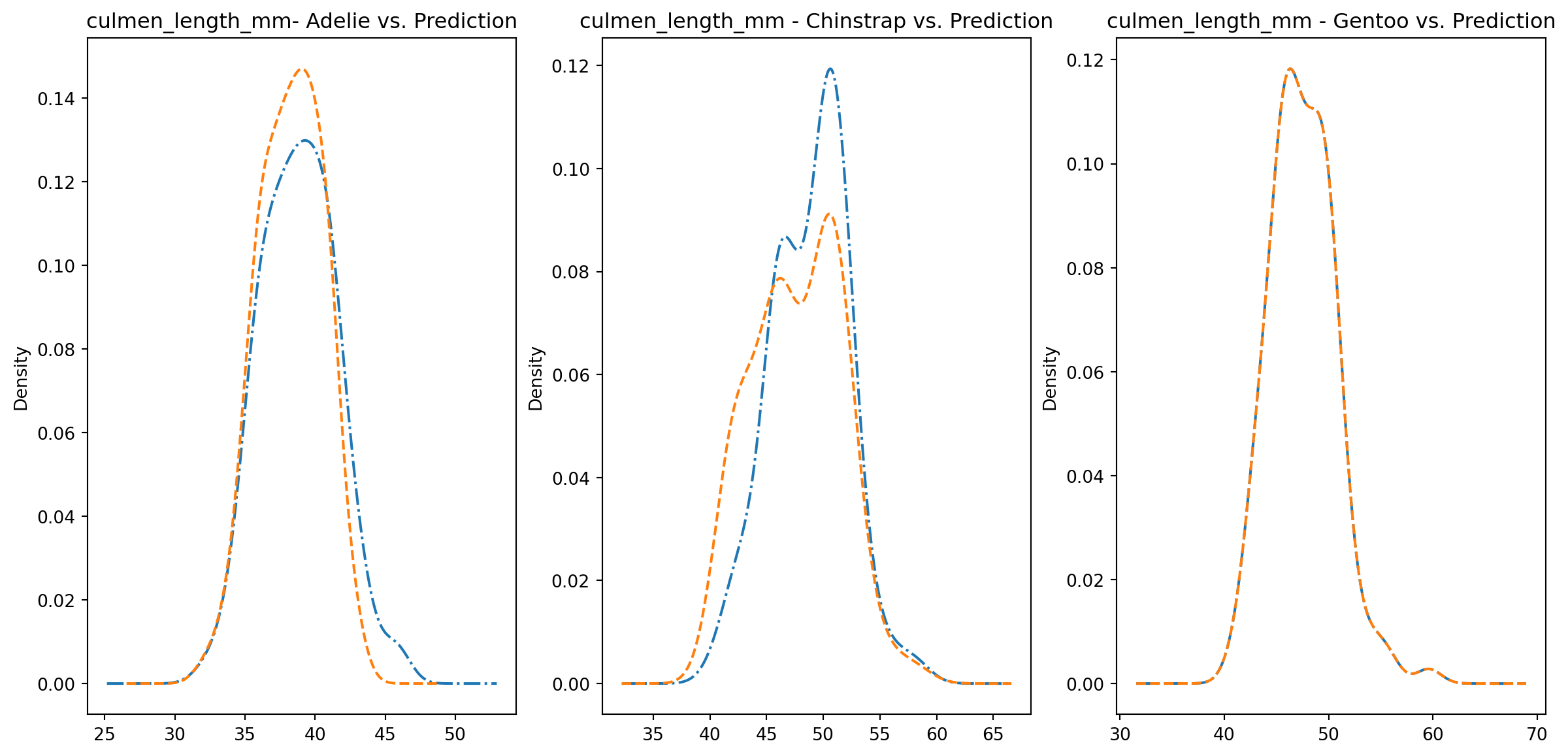
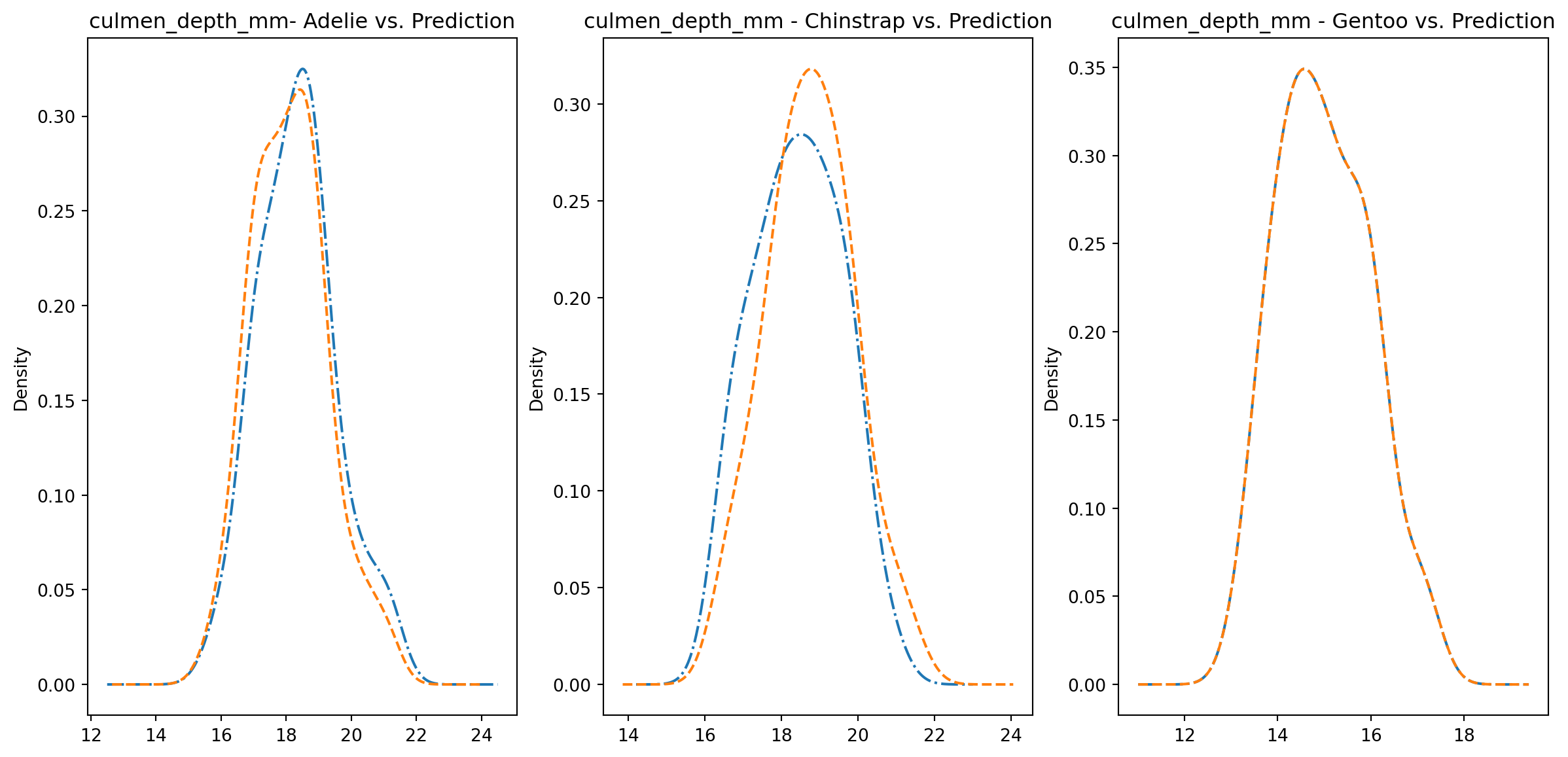
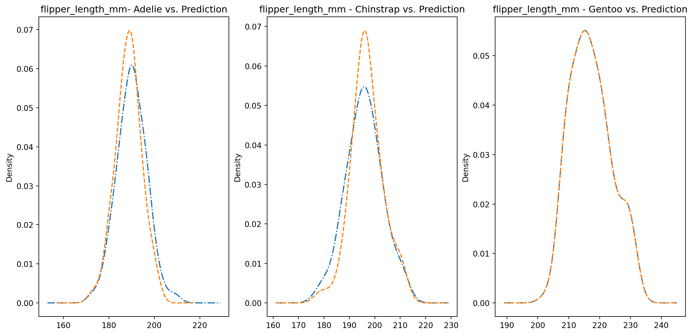
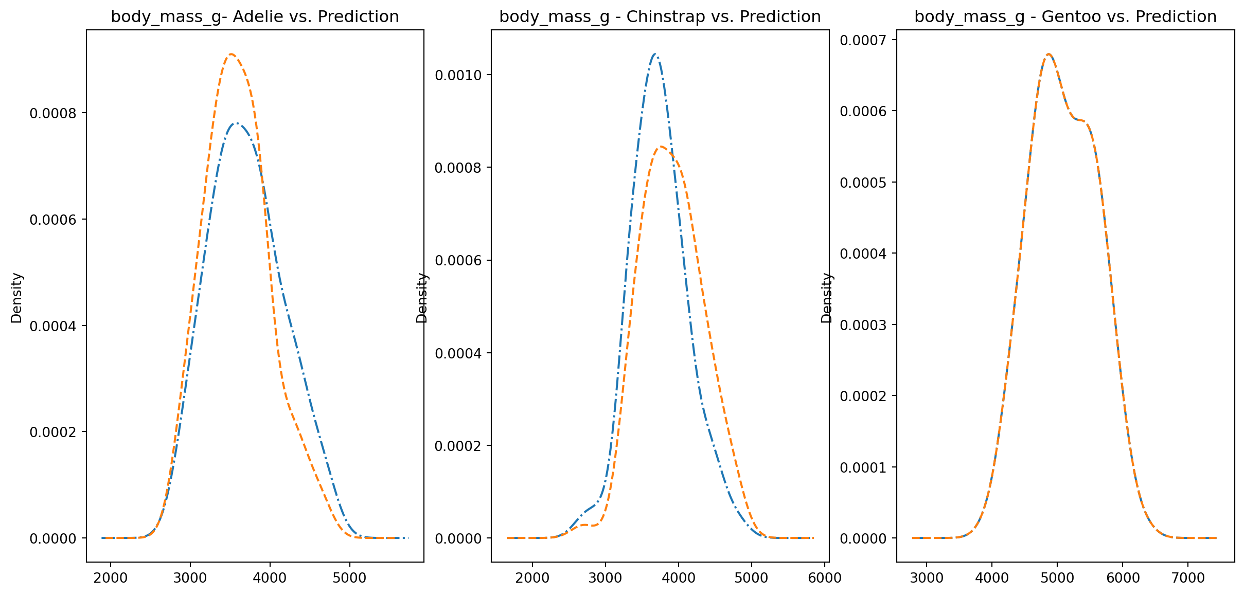
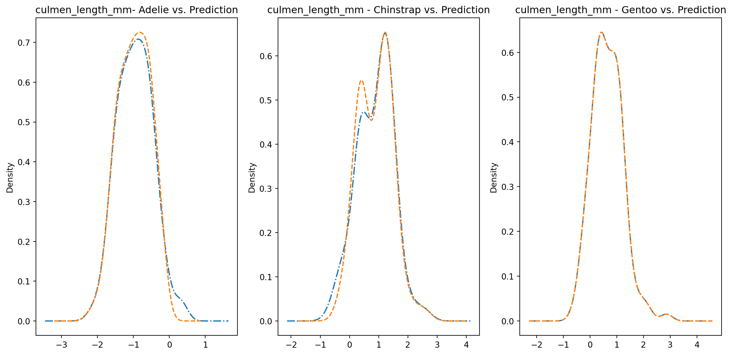
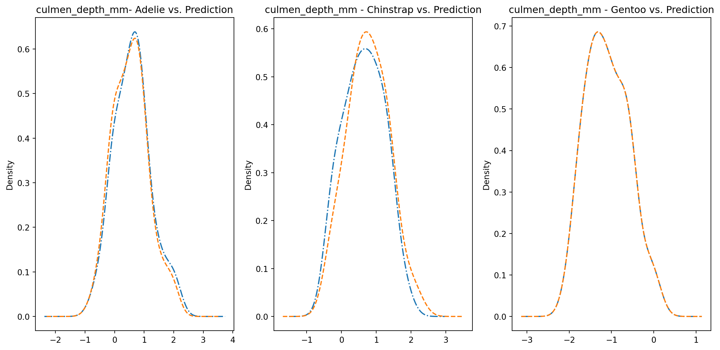
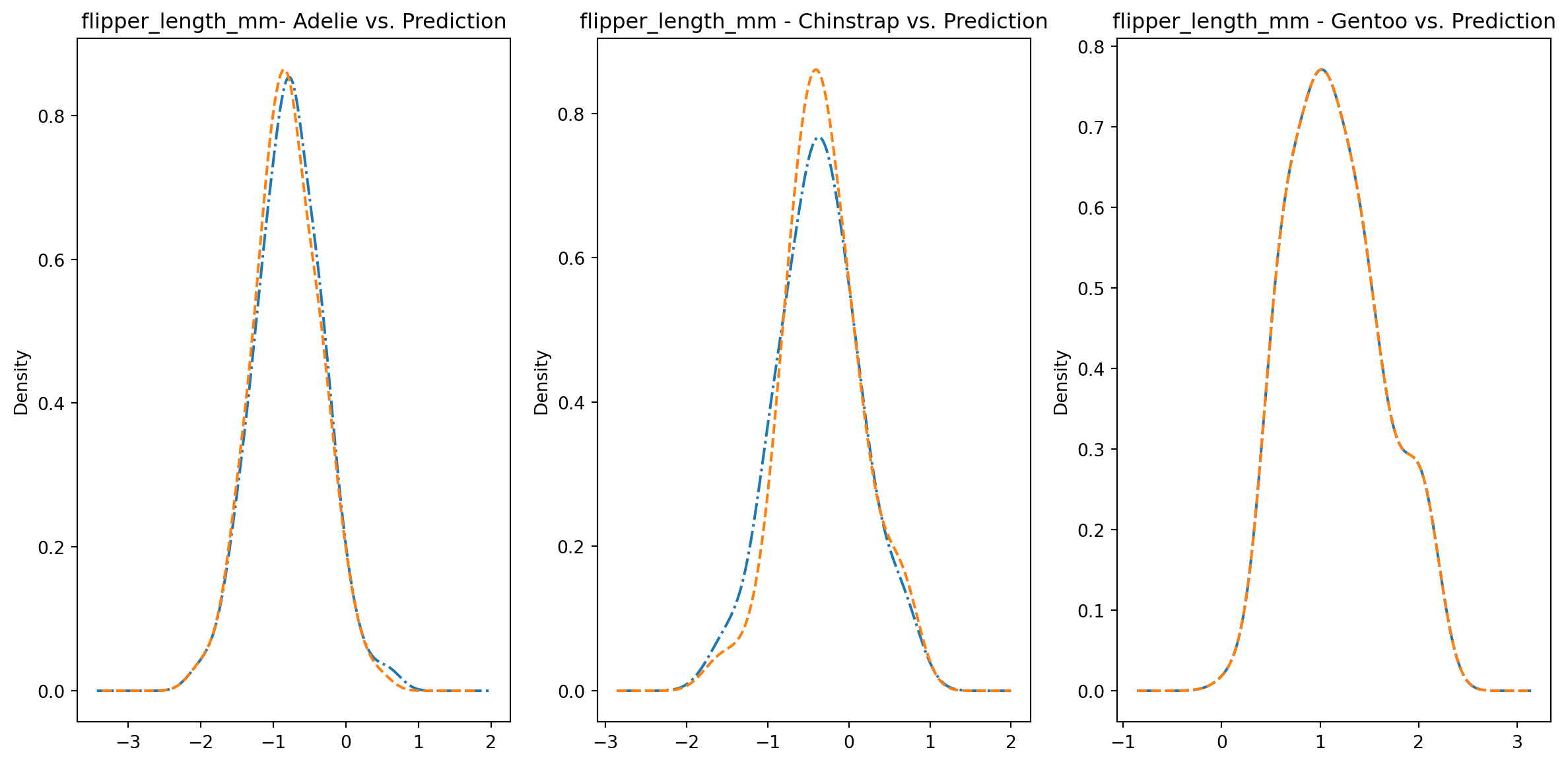
for col in numeric_cols: fig1, axes = plt.subplots(ncols=3, figsize=(15,7)) ax1, ax2, ax3 = axes penguins_data.loc[penguins_data["species"] ==0][col].plot.kde(ax=ax1, linestyle="-.", title=f"{col}- Adelie vs. Prediction") penguins_data.loc[penguins_data["predictions"] == class_to_prediction["adelie"]][col].plot.kde(ax=ax1, linestyle="--") penguins_data.loc[penguins_data["species"] ==1][col].plot.kde(ax=ax2, linestyle="-.", title=f"{col} - Chinstrap vs. Prediction") penguins_data.loc[penguins_data["predictions"] == class_to_prediction["chinstrap"]][col].plot.kde(ax=ax2, linestyle="--") penguins_data.loc[penguins_data["species"] ==2][col].plot.kde(ax=ax3, linestyle="-.", title=f"{col} - Gentoo vs. Prediction") penguins_data.loc[penguins_data["predictions"] == class_to_prediction["gentoo"]][col].plot.kde(ax=ax3, linestyle="--") plt.plot()
We can see pretty clearly in the data that one group of penguins is predicted perfectly, the genttos, as the distributions are identical, while the two others were not predicted as perfectly as the distributions do not match as well.
Trying to improve the resutls
We could try to improve the previous results by also introducing the categorical data into the dataset, as previously we were primarily working with only the continous data. This will hopefully give the algorithm more data to distinguish between the groups.
We actually do not need as many columns for the categorical data. We can remove a few columns since the data for these columns can be extrapolated from the other columns.
Once again, let’s perform PCA to understand how the overall data was affected by the introduction of the new variables.
pca = PCA(n_components=2, random_state=42)two_component_penguins_data = pca.fit_transform(scaled_penguins_data)for i, target_class inenumerate(species_scheme): indices = penguins_data["species"] == i plt.scatter(two_component_penguins_data[indices, 0], two_component_penguins_data[indices, 1], label=target_class)plt.legend()
<matplotlib.legend.Legend at 0x29fc214d0>
This time, the difference between Adelies and Chinstraps is slightly more distinct as we can see that the Chistrap distribution is located slightly to the left of the Adelie distribution. This was not as apparent in the previous PCA run. Hopefully, we can achieve better clustering results due to this.
/Users/danielsabanov/.pyenv/versions/3.11.6/lib/python3.11/site-packages/sklearn/cluster/_kmeans.py:1416: FutureWarning: The default value of `n_init` will change from 10 to 'auto' in 1.4. Set the value of `n_init` explicitly to suppress the warning
  super()._check_params_vs_input(X, default_n_init=10)
Let us graph the resutls.
for i, target_class inenumerate(set(predictions)): indices = predictions == i plt.scatter(two_component_penguins_data[indices, 0], two_component_penguins_data[indices, 1], label=target_class)plt.legend()class_to_prediction = {"adelie": 0, "chinstrap": 2, "gentoo": 1}encoded["predictions"] = predictions
This time the label 0 correspnds to adelie, 1 corresponds to gentoo, and 2 corresponds to chinstrap. It appears that the classification this time went sligtly better as there is a more significant overlap between the adelie and chinstrap distributions. Be sure let’s examine the distributions in more details.
fig1, ax1 = plt.subplots(ncols=2, figsize=(20, 10))fig2, ax2 = plt.subplots(ncols=2, figsize=(20, 10))fig3, ax3 = plt.subplots(ncols=2, figsize=(20, 10))fig4, ax4 = plt.subplots(ncols=2, figsize=(20, 10))encoded.groupby("species")["culmen_length_mm"].plot.kde(ax=ax1[0], title="Culmen Length in mm - True")encoded.groupby("species")["culmen_depth_mm"].plot.kde(ax=ax2[0], title="Culmen Depth in mm - True")encoded.groupby("species")["flipper_length_mm"].plot.kde(ax=ax3[0], title="Flipper Length in mm - True")encoded.groupby("species")["body_mass_g"].plot.kde(ax=ax4[0], title="Body Mass in g - True")encoded.groupby("predictions")["culmen_length_mm"].plot.kde(ax=ax1[1], title="Culmen Length in mm - Predictions")encoded.groupby("predictions")["culmen_depth_mm"].plot.kde(ax=ax2[1], title="Culmen Depth in mm - Predictions")encoded.groupby("predictions")["flipper_length_mm"].plot.kde(ax=ax3[1], title="Flipper Length in mm - Predictions")encoded.groupby("predictions")["body_mass_g"].plot.kde(ax=ax4[1], title="Body Mass in g - Predictions")plt.plot()
[]
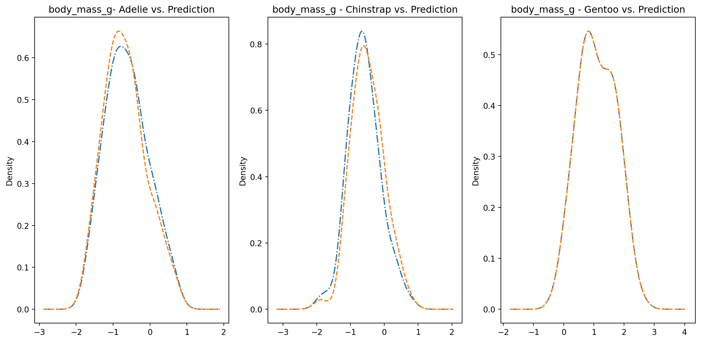
for col in numeric_cols: fig1, axes = plt.subplots(ncols=3, figsize=(15,7)) ax1, ax2, ax3 = axes encoded.loc[encoded["species"] ==0][col].plot.kde(ax=ax1, linestyle="-.", title=f"{col}- Adelie vs. Prediction") encoded.loc[encoded["predictions"] == class_to_prediction["adelie"]][col].plot.kde(ax=ax1, linestyle="--") encoded.loc[encoded["species"] ==1][col].plot.kde(ax=ax2, linestyle="-.", title=f"{col} - Chinstrap vs. Prediction") encoded.loc[encoded["predictions"] == class_to_prediction["chinstrap"]][col].plot.kde(ax=ax2, linestyle="--") encoded.loc[encoded["species"] ==2][col].plot.kde(ax=ax3, linestyle="-.", title=f"{col} - Gentoo vs. Prediction") encoded.loc[encoded["predictions"] == class_to_prediction["gentoo"]][col].plot.kde(ax=ax3, linestyle="--") plt.plot()
This time it appears that there is a much better overlap between the real and predicted distributions of the chinstrap and adelie respenctive populations. This is actually a sensible results since sex makes a difference in the sizes of the penguins, so given that data, we are better able to tell the difference if a penguinqu is of a certain species.
Refernces
Gorman KB, Williams TD, Fraser WR (2014) Ecological Sexual Dimorphism and Environmental Variability within a Community of Antarctic Penguins (Genus Pygoscelis). PLoS ONE 9(3): e90081. doi:10.1371/journal.pone.0090081